

Cinema of the Stands: How Italian Ultra Culture Redefined Global Streetwear
Long before Supreme turned the box logo into a religion, before Off-White slapped quotation marks on everything, there was the Curva. The Curva Sud. The Curva Nord. Those curved ends of Italian stadiums where choreographed chaos became high art, where smoke bombs painted the sky in team colors, and where a distinct visual language was being forged that would eventually redefine what we wear on our backs fifty years later.
This wasn't fashion. This was war paint. This was identity. And it changed everything.
The Theatre of Identity
In the 1960s and 70s, something shifted in the terraces of San Siro, Stadio Olimpico, and Stadio delle Alpi. The ultras : hardcore supporter groups : began developing an aesthetic vocabulary that transcended football fandom and entered the realm of pure visual culture. Massive hand-painted banners (striscioni) unfurled across entire stands. Pyrotechnics choreographed to the second. Typography that screamed defiance. Color blocking that could be read from across the city.
The ultras understood something that fashion houses would take decades to grasp: belonging requires a uniform, and a uniform requires intention. Every detail mattered. The cut of your jacket. The specific shade of your scarf. The brand on your chest. Stone Island. C.P. Company. Diadora. Sergio Tacchini. These weren't just labels : they were codes, silent signals that announced your allegiance before you ever opened your mouth.
The beauty was in the contradiction. Ultra culture demanded both conformity and individuality. You dressed like your group, but the how : that was personal. A Stone Island badge here. A vintage Ellesse track jacket there. The marriage of British terrace culture and Italian bella figura created something entirely new: a streetwear aesthetic that was simultaneously aggressive and refined, tribal and sophisticated.
From San Siro to SoHo: The Global Migration

What happened next wasn't planned. It was cultural osmosis. As European football gained global audiences through the 90s and early 2000s, the ultra aesthetic began bleeding into broader street culture. Skaters in London started wearing Sergio Tacchini. Hip-hop heads in New York discovered Stone Island through grime artists. The bold graphics, the militaristic precision, the unapologetic territoriality : it spoke to urban youth worldwide who were navigating their own tribal landscapes.
The brands the ultras championed became streetwear staples. Stone Island's compass badge became as recognizable as the Nike Swoosh in certain circles. C.P. Company's goggle jackets transformed from football terrace gear into high-fashion grails. Fred Perry polos, once the uniform of English mods and Italian casuals, became shorthand for a particular kind of sharp, aggressive style.
But more importantly, the visual language migrated. That ultra sensibility : bold typography, confrontational slogans, color-blocked intensity, hand-drawn rawness : became the foundation of modern streetwear graphics. Look at any contemporary street brand and you'll see the DNA: the in-your-face text treatments, the layered compositions, the aggressive use of negative space, the almost propaganda-like visual punch.
Brands like Weekend Offender and Ma.Strum emerged as direct descendants, explicitly channeling ultra culture into contemporary menswear. But even mainstream brands couldn't ignore it. The resurgence of vintage sportswear, the obsession with retro football shirts, the entire "terrace casual" movement : it all traces back to those curved ends of Italian stadiums where visual identity was forged in smoke and song.
The Typography of Resistance
What made ultra graphics so distinctive? The urgency. Everything looked like it was created in a basement at 3 AM before a big match : because often it was. Hand-painted banners with imperfect letterforms. Stenciled slogans that dripped with DIY authenticity. Typography that felt yanked from political propaganda posters and repurposed for football warfare.
This wasn't the clean, corporate world of official club merchandise. This was raw. Rebellious. Real. The letterforms had weight. The compositions had attitude. Every banner, every flag, every bit of visual material from the Curva carried the same message: we own this space, we define this identity, and we do it on our own terms.
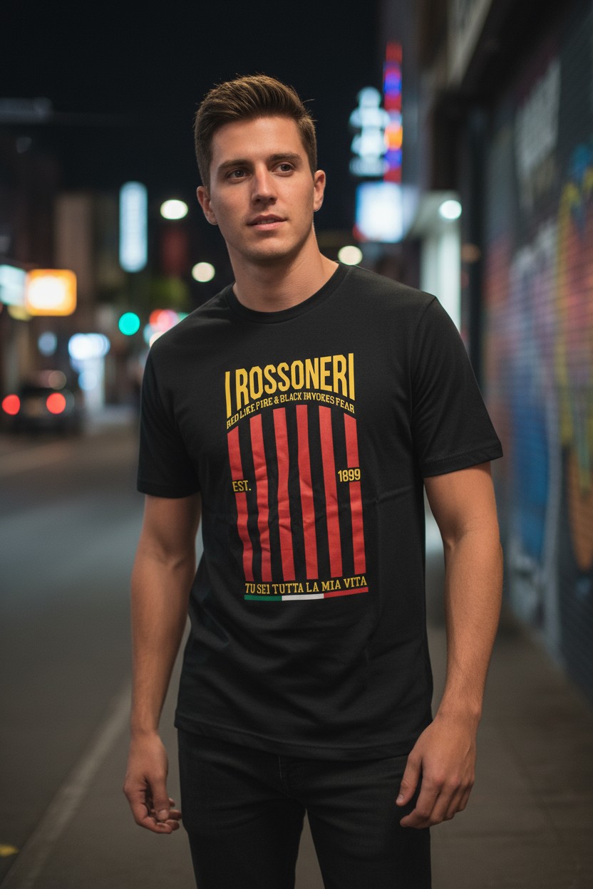
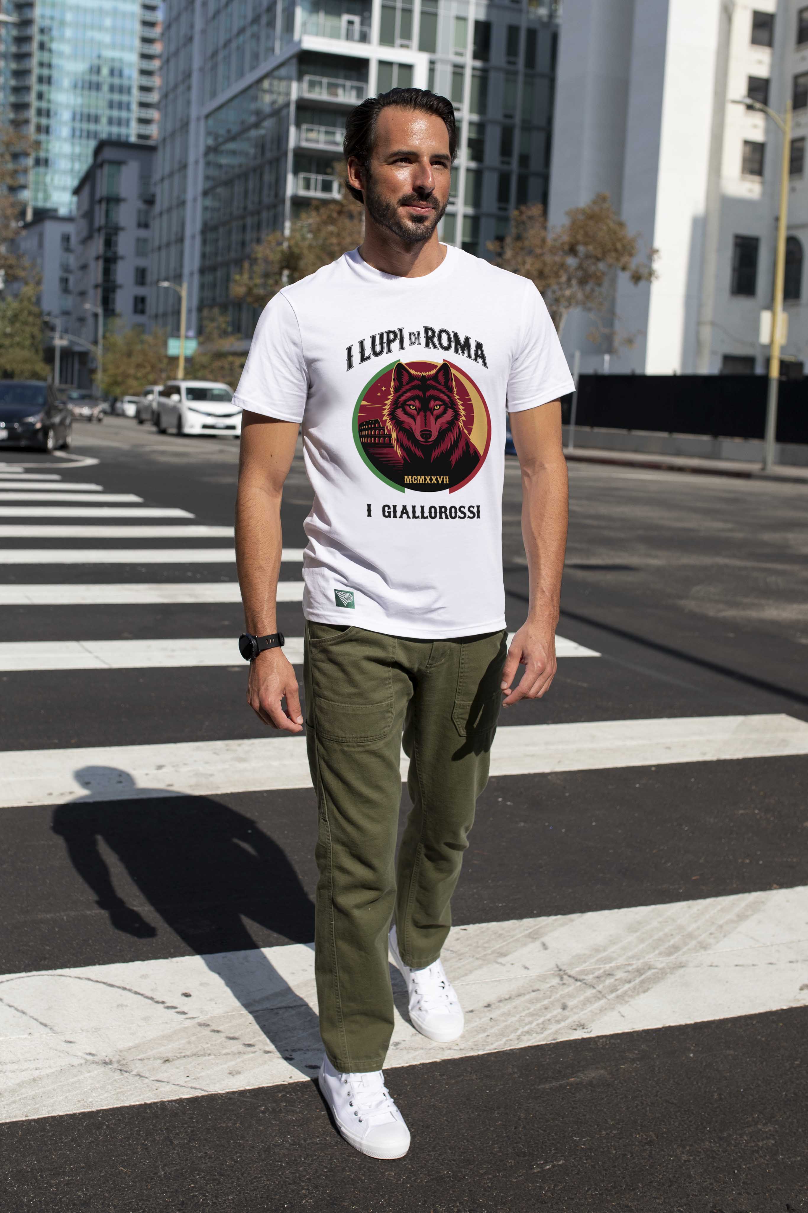
That aesthetic directness : that refusal to be polished or commercialized : is what gives ultra-inspired graphics their staying power in streetwear. When you see "I LUPI DI ROMA" screaming across a chest, or "BIANCONERI" rendered in that specific aggressive caps treatment, you're not looking at design for design's sake. You're looking at territorial marking. Cultural warfare made wearable.
At Vintage Pitch, we understand that these graphics aren't decorative. They're devotional. When we design pieces for our Serie A Icons collection, we're not creating "retro-inspired fashion" : we're channeling that same raw energy that once filled the Curva Sud at San Siro during a Derby della Madonnina.
The Symbolism of the Stand
The ultra world operates on symbols. The wolf for Roma. The biscione for Inter. The black and white stripes that need no explanation. But beyond club crests, there's a deeper symbolic vocabulary: flames representing passion, skulls representing loyalty until death, medieval imagery suggesting warrior culture, raised fists of solidarity.

This symbolic language translated perfectly into streetwear because it speaks in universal terms while maintaining specific cultural roots. You don't need to know the exact history of the Boys San to understand that a flaming skull with crossed scarves means unwavering allegiance. The symbols are primal, immediate, visceral : exactly what great streetwear graphics should be.
And here's where it gets interesting: Italian ultra culture never separated football from life, sport from culture, the sacred from the profane. The same mentality that produces elaborate stadium choreography also produces incredible food culture, deep family bonds, and fierce neighborhood pride. It's all connected. The ultra isn't just passionate about their club : they're passionate about everything that defines their identity.
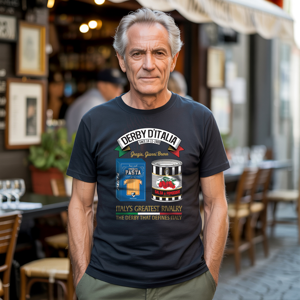
Which is why blending calcio and cucina isn't just cute marketing at Vintage Pitch : it's authentic to the ultra sensibility. The same person creating a massive banner for the Curva Nord is the one who knows the best carbonara spot in Rome. Football and food, tradition and rebellion, heritage and contemporary style : it's all one inseparable cultural whole.
The Legacy Lives in the Details
Walk into any serious vintage football shop today and watch how people examine a retro Napoli jacket or a '90s Inter third kit. They're not just looking at sportswear : they're decoding cultural artifacts. The specific font used for player names. The exact color gradient on the sponsor logo. The weight of the fabric. The stitching patterns.

This obsessive attention to detail? That's ultra culture. That's what happens when clothing becomes identity, when what you wear is as important as what you believe. And that mindset : that refusal to accept anything less than authentic, down to the smallest manufacturing detail : is what elevated streetwear from casual wear to cultural movement.
The brands that understand this succeed. The ones that treat it as a trend, as mere aesthetic borrowing, fade. Because the people who grew up in this culture, or who discovered it and genuinely fell in love with it, can smell inauthenticity from a mile away. It's not enough to slap "Ultras" on a t-shirt. You have to understand why that word matters. What it cost. What it means to stand in the Curva for ninety minutes in the freezing rain, losing your voice, living every second of the match like your life depends on the result.
That's the energy Vintage Pitch captures : not the superficial aesthetics, but the feeling. The way an ultra feels walking into the stadium wearing their colors. That mix of pride, defiance, belonging, and ready-for-anything attitude. Whether it's our Derby collections celebrating football's greatest rivalries or our Calcio Cucina line blending two Italian passions, every piece carries that curva spirit.
Wearing Your Allegiance
The Italian ultras taught global streetwear something profound: clothing isn't just self-expression : it's tribal identification. It's showing up. It's representing. It's wearing your heart, your history, your people on your chest and back and sleeves, refusing to blend in, demanding to be seen and counted.
That philosophy : that a t-shirt can be a banner, a jacket can be armor, and style can be resistance : changed everything. From the terraces of Serie A to the streets of Tokyo, Seoul, New York, and London, that ultra sensibility endures. Bold graphics. Meaningful symbols. Colors that mean something. Details that matter.
The Curva gave streetwear its swagger, its symbols, and its soul. Everything else is just following the choreography. 🔥⚽️