

The Art of the Away Kit: Why Vintage Away Colors Rule the Streets
There's something rebellious about an away kit. While home jerseys carry the weight of tradition: those sacred colors that can't be touched, modified, or questioned: away kits exist in a space of creative freedom. They're the designers' playground, the manufacturers' canvas for experimentation, and for those of us who live and breathe calcio culture, they're often the most stylish piece in the wardrobe.
The 1990s understood this better than any era before or since. That decade gave us Arsenal's "bruised banana," Newcastle's maroon and blue hoops that barely saw the pitch, and the USA's denim disaster-turned-grail. These weren't just alternate uniforms: they were statements. Risky, bold, sometimes borderline insane statements that dared to ignore convention. And now, decades later, they're the jerseys that command the highest prices on vintage markets and inspire the most passionate streetwear.
But here's what most people miss: the real genius of vintage away kits wasn't just that they were different. It's that they were wearable in ways home kits never could be.
Why Away Colors Always Had More Soul
Think about the traditional home kit: Inter's nerazzurri stripes, Roma's giallorossi, Milan's rossoneri. These are uniforms built for the pitch, designed to be seen from the curva, engineered to photograph well under stadium lights. They're bold, aggressive, unmistakable. They're also, if we're being honest, sometimes a bit much for everyday wear.
Now consider Inter's classic white away kit with those subtle blue accents: the one that looks like it was designed for a Roman summer, not a Milano downpour. Or Roma's white kit with those vertical pinstripes that could pass for something out of a Soho boutique window. These weren't just alternatives; they were transformations. The same club DNA, the same heritage, but filtered through a lens that understood aesthetics beyond the stadium.

The secret weapon of vintage away kits has always been their lighter palettes. White, cream, powder blue, soft yellow: these are the colors that let you wear your football allegiance without screaming it. They're the difference between costume and style, between merch and Italian football streetwear that actually works on the street.
The White Canvas Philosophy
There's a reason why so many legendary away kits started with a white base. White doesn't just offer a blank canvas for designers: it offers versatility for the wearer. It catches light differently, photographs better, pairs with literally anything in your closet. It's the same reason why classic sneakers work in white, why premium basics come in white, why every style guide eventually circles back to white.
But football white isn't basic white. It's white with attitude, white with purpose, white with a story stitched into every seam.
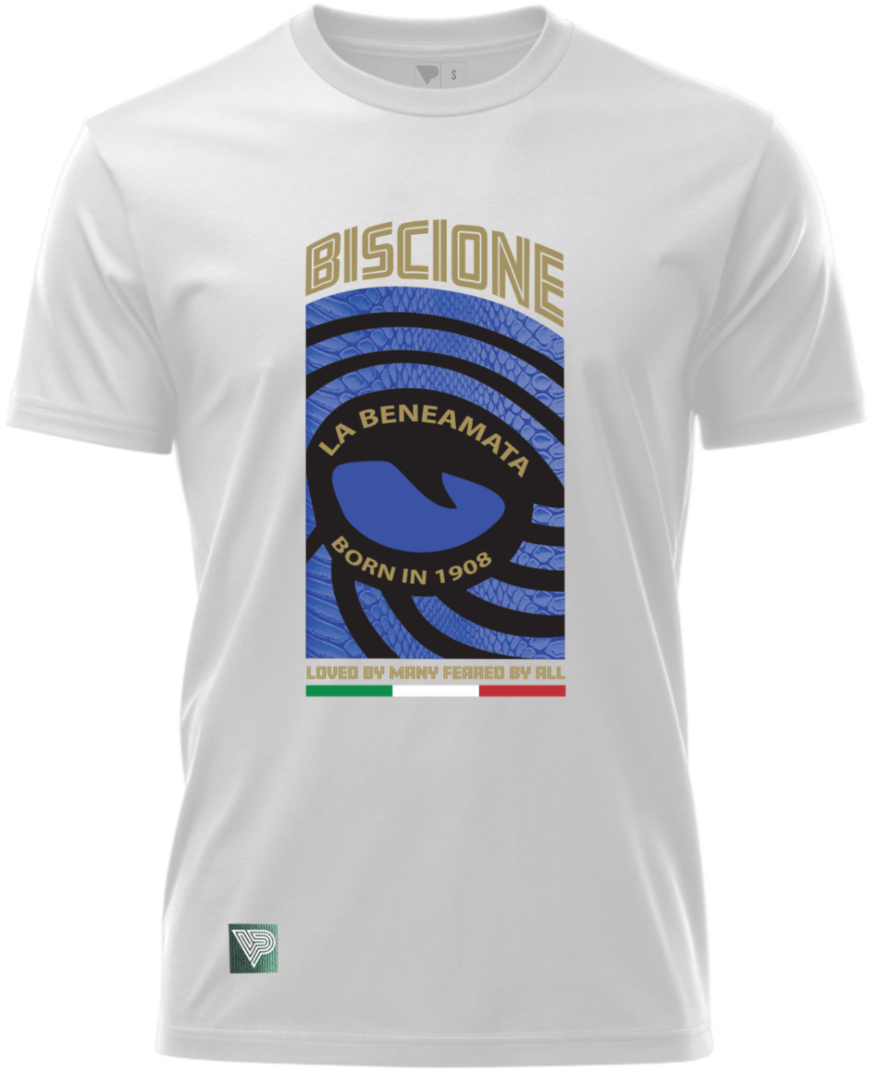
Take the Inter away aesthetic: that clean white disrupted by blue serpent details, the Biscione winding its way through the design like it's been there since 1908. This isn't just an AC Milan vintage inspired t-shirt competitor; it's a completely different animal. Where home kits demand attention, this whispers confidence. It says you know your calcio history so well you don't need to shout about it.
The same principle applies to Roma's away tradition. Those white and pinstripe combinations weren't just pretty: they were strategic. They took the intensity of giallorossi and translated it into something you could wear to an aperitivo, to a gallery opening, to anywhere that demands you look intentional about your choices.
From Pitch to Pavement: The Streetwear Evolution
Here's where vintage away kit aesthetics completely dominate modern streetwear: they were accidentally designed for layering. Those lighter bases, those subtle color accents, those clean lines: this is what contemporary fashion has spent the last decade trying to achieve. The difference is that these designs came from football culture, not from a mood board in a design studio.

A Roma football culture tee built on away kit principles works under a blazer. It works with raw denim. It works with tailored trousers or beat-up Sambas. Try doing that with a traditional home jersey. You can't: at least not without looking like you're headed to the match instead of living your life.
This is the art of the away kit translated into calcio culture apparel: taking the soul of the club and making it livable. It's respecting the heritage while understanding that not every moment calls for maximum intensity. Sometimes you want to rep La Lupa without broadcasting it from space.

The modern vintage-inspired approach understands this completely. When you see designs that blend clean white bases with strategic pops of color: the gold and red of Roma, the blue serpent of Inter, the rossoneri shades of Milan: you're seeing the away kit philosophy in action. These aren't diluted versions of club identity; they're sophisticated translations.
The Risk-Takers That Became Icons
The best away kits in history shared one quality: they were controversial when they dropped. The "bruised banana" Arsenal kit? Mocked mercilessly. That USA denim number? A punchline for years. Newcastle's maroon experiment? Used five times before being shelved.
And yet these are now the grails. The pieces that command respect. The designs that influenced an entire generation of football fashion. Why? Because they dared to be different when different wasn't safe.
This is what separates calcio culture from generic sports merchandise: the willingness to embrace risk, to honor the weird experiments, to understand that football's most interesting moments often happened in away colors. Calcio history is full of legendary performances in away kits: underdog victories, statement wins, the moments when a club proved it didn't need home advantage to dominate.

When you wear vintage-inspired designs that pull from away kit aesthetics, you're aligning yourself with that energy. You're saying you appreciate the deeper cuts, the B-sides, the moments that casual fans missed but true tifosi remember forever.
Building Your Away Kit Aesthetic
Here's how to actually style this stuff without looking like you're trying too hard:
Start with one statement piece. A clean white tee with subtle club details works as your foundation. This is your entry point: recognizable to those who know, understated enough to work anywhere.
Layer with neutrals. The beauty of away kit-inspired Italian football streetwear is that it already did the color work for you. Let the design breathe. Olive chinos, black denim, grey wool: these are your supporting players.
Keep sneakers simple. White leather low-tops or classic silhouettes. Remember, the vintage away kit aesthetic is about sophistication, not competition for attention.
Accessorize with intention. A vintage watch, a leather bracelet, maybe a simple chain. You're building an outfit, not a costume. The football reference should be your anchor, not your entire personality.

The goal is to look like someone who understands both football heritage and contemporary style: someone who could discuss tactical formations over espresso and still fit in at a decent cocktail bar. That's the sweet spot where vintage away kit aesthetics live.
The Future Is Actually The Past
Modern football has largely abandoned the creative risk-taking that made away kits special. Today's alternates are safe, focus-grouped, designed to offend nobody and inspire nobody. They're templates with team colors swapped in, marketing exercises masquerading as design.
This is exactly why vintage away kit-inspired calcio culture apparel matters more now than ever. It preserves the era when manufacturers actually tried, when designers were allowed to be weird, when football culture embraced experimentation instead of fearing it.
Every time you see another identical modern kit drop: same template, different colors: it reinforces why those vintage designs resonate so deeply. They came from an era that understood football culture as culture, not just commerce. They respected fans enough to take risks.
Wear Your Heritage, Not Your Uniform
The art of the away kit has always been about transformation: taking the essential spirit of a club and expressing it in new ways. It's the same reason why the best Italian fashion houses can create wildly different collections while maintaining their core identity. The DNA remains, but the expression evolves.
That's what makes vintage away kit aesthetics so powerful for modern style. You're not cosplaying as a player. You're not wearing a jersey to the pub. You're wearing calcio culture as it was meant to be worn: with confidence, knowledge, and style that transcends the pitch.
The away kit understood something that modern football has forgotten: sometimes the most powerful statement is the one that doesn't scream. Sometimes tradition is best honored not by repeating it exactly, but by translating its spirit into something new.
That white base with strategic color. Those clean lines with heritage details. That balance between recognition and subtlety. This is the art of the away kit, and it rules the streets because it was never really designed for the pitch in the first place.
It was designed for people who live football culture instead of just watching it. 🎨⚽️